Table of Contents
What Is Visual Merchandising?
Visual merchandising is the practice of designing and arranging retail environments — storefronts, displays, layouts, lighting, signage — to attract customers, keep them in the store longer, and ultimately get them to buy. It’s the reason you walk into a clothing store and feel a certain way, or why grocery stores put the milk at the back.
Every retail decision you can see (and some you can’t, like scent and music) falls under the visual merchandising umbrella.
More Than Pretty Window Displays
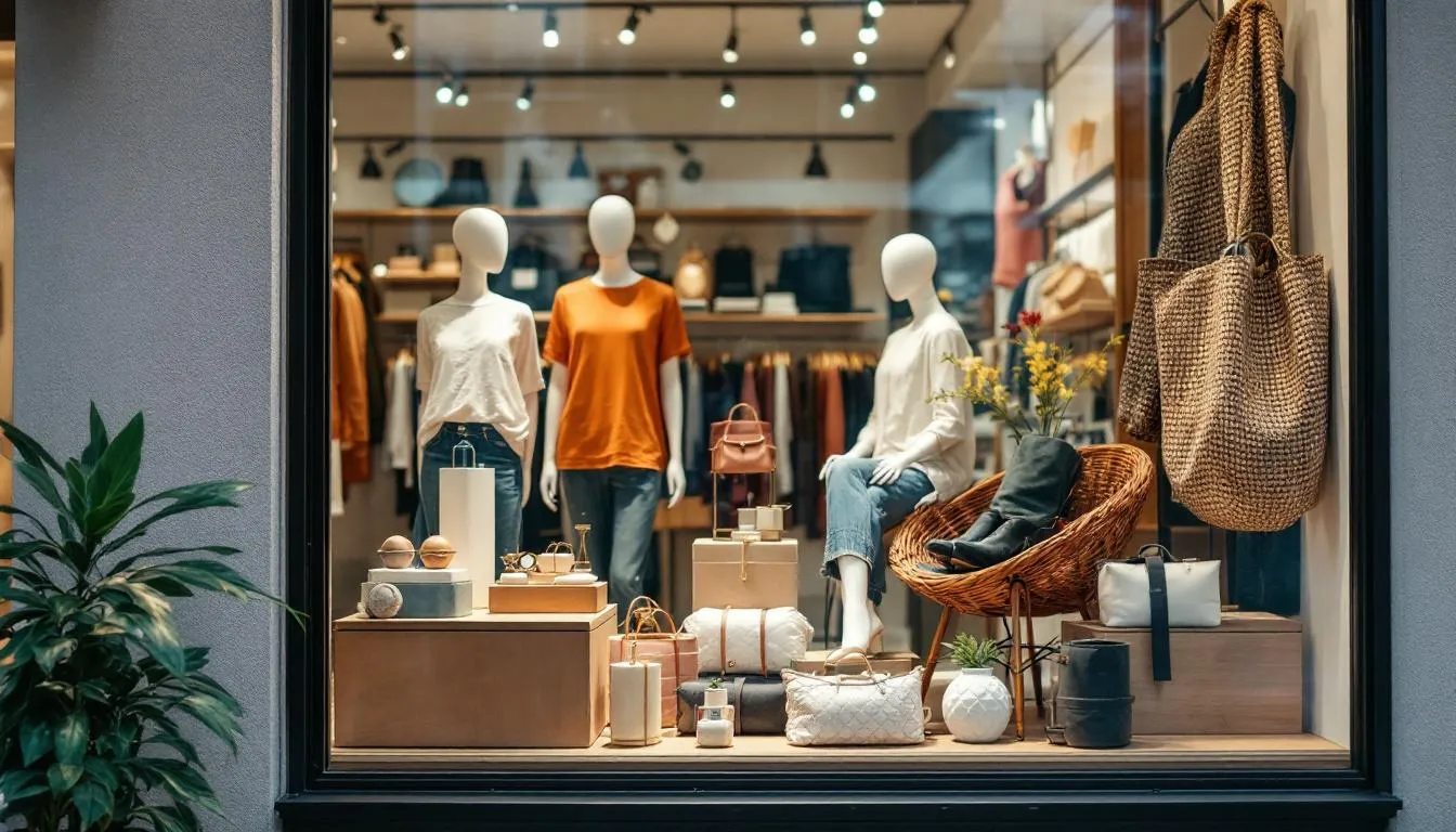
Most people associate visual merchandising with department store window displays — the elaborate holiday scenes at Macy’s or Selfridges. And yes, that’s part of it. But the discipline goes far deeper than arranging mannequins.
Visual merchandising covers the entire customer experience from the moment someone spots your storefront to the moment they leave (ideally with a bag in hand). That includes:
- Storefront and window design — your first impression, your silent advertisement
- Store layout and traffic flow — how people physically move through the space
- Product placement and grouping — what goes where, and next to what
- Signage and graphics — price tags, promotional banners, directional signs
- Lighting — arguably the most underrated element
- Color and seasonal themes — creating mood and urgency
- Sensory elements — music, scent, even temperature
The goal isn’t just to look nice. It’s to translate brand identity into a physical experience that drives measurable commercial results. A great visual merchandiser understands both aesthetics and psychology.
A Brief History of Making Stores Look Good
The idea of presenting goods attractively is as old as trade itself — Roman market stalls were arranged to catch the eye. But visual merchandising as a formal discipline traces back to the mid-1800s, when plate glass technology allowed for large store windows.
Harry Gordon Selfridge, who opened his London department store in 1909, is often credited with popularizing the modern window display. His philosophy was simple but radical for the time: shopping should be entertainment. He turned his windows into theatrical productions and opened his displays so customers could touch merchandise — unheard of in an era when goods were kept behind counters.
By the mid-20th century, visual merchandising had become a recognized profession. The rise of self-service retail in the 1950s and 60s made it even more critical — when there’s no salesperson guiding every purchase, the environment itself has to do the selling.
Today, visual merchandising accounts for a significant portion of retail budgets. Apple reportedly spends more per square foot on its store environments than almost any other retailer, and the result is one of the most recognizable retail experiences on earth.
The Psychology Behind the Layouts
Here’s where things get interesting — and a little sneaky. Store layouts aren’t random. They’re designed using decades of consumer behavior research.
The Decompression Zone
The first 5 to 15 feet inside a store entrance is called the decompression zone. Customers entering from outside need a moment to adjust — to the lighting, temperature, and visual stimulation. Anything placed in this zone gets overlooked. Smart retailers keep this area open and inviting, saving their high-impact displays for just beyond it.
Grid, Loop, and Free-Flow Layouts
Grid layouts — think grocery stores and pharmacies — are efficient. Parallel aisles maximize product exposure and make navigation predictable. Customers see more products this way, but the experience isn’t exactly exciting.
Loop layouts (also called racetrack layouts) guide customers along a predetermined path through the store. IKEA is the most famous example. You enter and follow a winding route that exposes you to the entire inventory before you reach checkout. This design increases impulse purchases because you encounter products you weren’t looking for.
Free-flow layouts — common in boutiques and luxury stores — have no fixed traffic pattern. Fixtures are placed at irregular angles to create a relaxed, exploratory feel. These work when the goal is to encourage browsing rather than efficient shopping.
The Right Side Bias
Research consistently shows that most shoppers (especially in countries that drive on the right) naturally turn right upon entering a store. The right-hand wall becomes prime real estate — retailers call it the “power wall.” High-margin products and new arrivals typically go here.
Eye Level Is Buy Level
Products placed at eye level sell 8-35% better than items on lower shelves. This is why major brands pay grocery stores slotting fees to get premium shelf position. Kids’ cereals, you may have noticed, are placed at kid eye level — not yours.
The Elements That Actually Matter
Lighting
Lighting might be the single most powerful tool in visual merchandising, and it’s the one most small retailers get wrong. Good lighting does three things: it makes products look appealing, it creates atmosphere, and it guides attention.
Accent lighting draws the eye to specific products or displays — it’s why jewelry stores use intense spotlights. Ambient lighting sets the overall mood: warm tones feel intimate and luxurious, while cool, bright lighting feels clean and modern. Task lighting helps customers examine products closely.
The difference between fluorescent tubes and thoughtful LED design can be the difference between a store that feels like a warehouse and one that feels like a destination. Studies suggest that appropriate lighting can increase sales by up to 12%.
Color
Color affects mood and behavior more than most people realize. Warm colors (red, orange, yellow) create urgency and energy — they’re used for clearance sales and fast-food restaurants for a reason. Cool colors (blue, green, purple) slow people down and promote calm, extended browsing.
Red specifically triggers urgency. It’s not a coincidence that sale signs are almost universally red. But too much red creates anxiety and pushes people out. The trick is strategic deployment.
Luxury brands tend toward neutral palettes — black, white, cream — because restraint itself communicates exclusivity. Walk into a Chanel boutique and you’ll see a very different color story than a Target.
Focal Points and the Rule of Three
Every good display has a focal point — the one thing your eye goes to first. Without it, customers face visual overload and look at nothing. Window displays typically use the “rule of three”: odd-numbered groupings (three mannequins, three products, three height levels) are more visually appealing than even numbers. Your brain processes asymmetry as more interesting.
Pyramid arrangements — tallest items in the center, shorter items flanking — create natural focal points and work almost universally.
Signage
Bad signage kills good displays. The rule is simple: signs should answer one question per sign. Price? That’s one sign. Product benefit? Another. Brand story? Another. Trying to cram everything onto one sign guarantees nobody reads any of it.
Typography matters more than you’d think. Fonts communicate personality. A handwritten chalkboard sign says “artisanal” and “personal.” A clean sans-serif sign says “modern” and “professional.” Comic Sans says… well, nothing good.
Window Displays: Your Silent Salesperson
Window displays are the most visible element of visual merchandising, and the numbers back up their importance. Research from NPD Group found that window displays influence about 24% of purchases at stores shoppers hadn’t planned to visit.
The best window displays tell a story in under 5 seconds — that’s roughly how long a pedestrian glances at a storefront. They use a single clear theme, limited color palette, strong lighting, and one dominant focal point. The worst try to showcase every product in the store.
Seasonal windows (holiday, back-to-school, summer) create urgency and give customers a reason to visit even if they weren’t planning to shop. Macy’s holiday windows in New York attract over 10,000 viewers per hour during peak season, making them both a retail tool and a cultural event.
Digital and Omnichannel Visual Merchandising
The principles haven’t changed much, but the tools have. Digital screens, interactive displays, augmented reality mirrors, and social media integration are reshaping how stores present products.
Nike’s flagship stores use massive LED walls and data-driven product recommendations. Sephora lets customers virtually try on makeup through augmented reality. Rebecca Minkoff’s stores have interactive mirrors in fitting rooms that suggest accessories and alert staff when a customer needs a different size.
E-commerce visual merchandising borrows heavily from physical retail principles. Product photography, page layouts, homepage “window displays,” and the strategic placement of items in search results all apply the same underlying psychology — guide the eye, create desire, reduce friction, close the sale.
The growing trend of “phygital” retail — blending physical and digital — means visual merchandisers increasingly need to think about how in-store displays connect to Instagram feeds, how QR codes integrate with product storytelling, and how the physical experience reinforces the online brand (and vice versa).
Measuring What Works
Visual merchandising has historically been more art than science, but that’s changing. Modern retailers use:
- Heat mapping — tracking where customers walk and where they linger
- Conversion rates — what percentage of people who see a display actually buy
- Sales lift — comparing sales of featured vs. non-featured products
- Dwell time — how long customers spend in specific areas
- A/B testing — trying two different displays and measuring which performs better
The data often surprises. A display that looks stunning might not sell well because it’s too intimidating to approach. A simple product stack with a clear price sign might outperform an elaborate artistic installation.
Common Mistakes
Even experienced retailers make predictable visual merchandising errors:
Overcrowding. More product doesn’t mean more sales. Crowded displays feel overwhelming and cheap. Luxury retailers intentionally display fewer items because negative space communicates value.
Ignoring the five senses. Visual merchandising is called “visual,” but the best practitioners think about all senses. An Abercrombie & Fitch store used to hit you with fragrance before you even walked in. Bakeries let the smell of fresh bread reach the sidewalk on purpose.
Never changing. Displays that stay the same for months become invisible to regular passersby. Most visual merchandising guidelines recommend refreshing window displays every 2-4 weeks.
Forgetting the brand. A display can be beautiful and still be wrong for the brand. Every visual choice should reinforce who you are. If you’re a discount retailer, an overly polished display sends mixed signals.
Visual merchandising sits at the intersection of art, psychology, and commerce. Done well, it turns a retail space from a place that stocks products into a place that tells a story — and that story ends with a purchase.
Frequently Asked Questions
What is the difference between visual merchandising and store design?
Store design refers to the permanent architectural and structural layout of a retail space — the floor plan, fixtures, lighting infrastructure, and overall aesthetic. Visual merchandising is more fluid: it's the ongoing practice of arranging products, creating displays, designing signage, and curating the sensory experience within that space. Store design is the stage; visual merchandising is the performance.
How much does visual merchandising affect sales?
Significantly. Research suggests that window displays alone can influence up to 24% of purchases, and well-executed in-store displays can boost sales of featured products by 20-540%, depending on the product category and display quality. The Global Association of Visual Merchandisers estimates that shoppers make about 70% of purchase decisions in-store, making the physical environment a major sales driver.
What skills do visual merchandisers need?
Visual merchandisers typically need a mix of creative and commercial skills: color theory and design principles, spatial awareness, knowledge of retail trends, understanding of consumer psychology, basic carpentry and construction skills for building displays, and — increasingly — proficiency with digital tools like CAD software and social media content creation. Strong communication skills matter too, since you're constantly collaborating with buyers, marketing teams, and store managers.
Further Reading
Cite this article
APA
WhatIs.site. (2025). What Is Visual Merchandising?. Retrieved May 27, 2026, from https://whatis.site/visual-merchandising MLA
"What Is Visual Merchandising?." WhatIs.site, July 15, 2025, https://whatis.site/visual-merchandising. Accessed May 27, 2026. Chicago
WhatIs.site. "What Is Visual Merchandising?." Last modified May 12, 2026. https://whatis.site/visual-merchandising. HTML
<a href="https://whatis.site/visual-merchandising">What Is Visual Merchandising?</a> — WhatIs.site Related Articles
What Is Marketing?
Marketing is the process of identifying customer needs and promoting products or services to meet them. Learn about strategy, channels, and core concepts.
arts amp cultureWhat Is Graphic Design?
Graphic design uses typography, imagery, and layout to communicate ideas visually. Learn about design principles, tools, career paths, and the field today.
businessWhat Is Shop Management?
Shop management covers the systems and practices used to run a retail store efficiently. Learn about inventory, staffing, merchandising, and profitability.
arts amp cultureWhat Is Styling (Fashion)?
Fashion styling is the art of selecting and arranging clothing and accessories to create a specific look. Learn how stylists work and where they're needed.